The world of web design is constantly evolving—and new and better methods are always emerging as technology changes, improves, and becomes increasingly complex. User experience, after all, is important, not only in appealing to your prospects and customers online, but also ensuring the search engines understand your site and its content—and offer you a positive ranking when someone is searching for the products or services your company provides.
In this new blog, the web design experts at Woland Web will outline what you need to know about responsive and adaptive website design, and what you should consider when designing or redesigning your company’s website.
What is Adaptive Website Design?
Let’s start with the less popular of the two options: adaptive design. Adaptive sites use multiple static designs that automatically appear on corresponding display screens. That means that resizing the browser does not actually impact the design itself. An adaptive design is formulated to appeal to users on the six most common screen widths; this ranges from large desktops all the way to smartphones and other smaller mobile devices—and addresses the needs of a variety of users.
The upside of adaptive web design is that it has the opportunity to look the best since it shows a design that is made for multiple screen sizes. On the downside, an adaptive web design creates much more work for the person who is building the site.
Of course, if your business requires a site that offers specific capabilities for mobile sites; for instance, you have an online appointment scheduler that needs to be easy to use by a consumer, then an adaptive design can feel more intentional since it requires strategic planning.
Here are some pros associated with an adaptive design:
- Page speeds are usually faster.
- The user experience designer controls the layouts and provides an optimal design for each screen size. Because there are multiple layouts, content can be added or subtracted for each size if it makes sense for that field.
Here are some cons associated with an adaptive design:
- Duplicate content is used across multiple sites; this can hurt search engine rankings.
- The process associated with design is labor intensive, which can mean more expensive in the scheme of things.
What is Responsive Website Design?
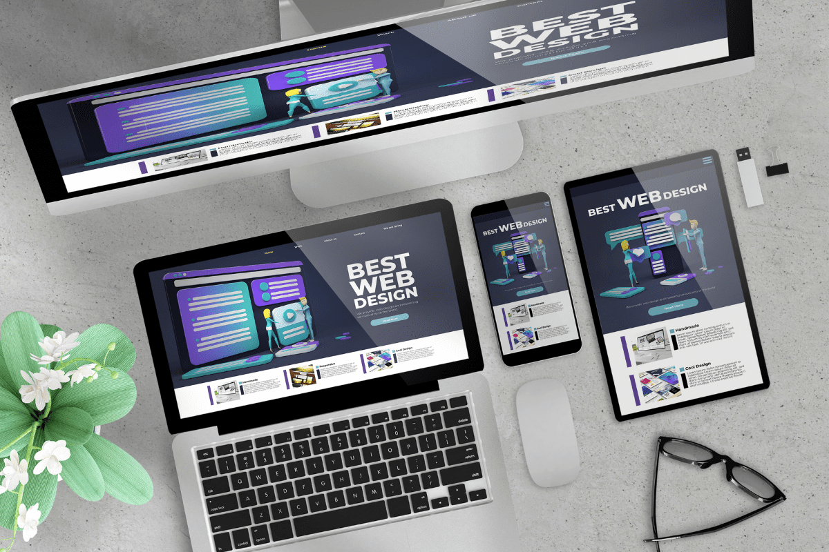
This is a website design that is created on a flexible grid, which means that no matter if a user happens to be on a mobile device, tablet, desktop, or laptop, the site’s elements will remain constant and aligned with the grid.
For instance, a desktop design typically uses a 12-column grid while a tablet uses 4-8 columns, and a smartphone uses one. Then, as a screen decreases in size, elements stack on top of each other, sort of like how water would take on the shape of whatever container it is in.
Here are some pros associated with responsive designs:
- The design process is quicker and requires less time.
- Consistency is created across devices, which is key to a positive user experience.
- This design is more SEO friendly.
- A single URL for each page accommodates any screen size; adaptive design uses multiple URLs for a single page.
- Many content management systems are created with the needs of marketers, not IT techs or developers in mind. This means that responsive design elements are already built into the templates these platforms provide—HubSpot’s CMS Hub is a great example of this.
- This is the more popular option as templates featuring responsive design are more than abundant.
Here are some cons associated with responsive design:
- A responsive site will probably take longer to load.
- There are many moving parts, so development time could be extended as the design has to be able to change to fit different screens. Much tweaking and auditing is usually needed before the website is ready to go live.
- Elements in the design move around, so images could be presented oddly or distorted, and text might be too wide or narrow to read, depending on the device.
What Design Style Should My Company Use?
If you feel unsure which design approach is right for your website—no matter if it is brand new or if you are considering overhauling your existing site—Woland Web would welcome the chance to consult with you.
We love partnering with our clients to understand their unique needs and create a website design solution that is best for them. Reach out to us today and schedule a website design consultation. Our team would be happy to guide you.


